A system for moving from
brand to innovation.
One living document for the logo, color, typography, components, voice, and visual motifs that make Solid Digital look and sound like Solid Digital, everywhere we show up.
The story the system serves.
Solid Digital is the full-spectrum digital transformation partner for ambitious mid-market organizations.
Everything in this document (a headline, a button, a social tile) should ladder back to this positioning. If it doesn't feel like it moves a client from brand toward innovation, it probably isn't ours.
Positioning Statement
The only firm that combines AI-powered innovation, software craftsmanship, and marketing intelligence under one roof, moving clients from brand to breakthrough at a pace their competitors can't match.
Tagline
"From brand to innovation, faster than you thought possible."
Primary tagline. Test in copy before introducing alternates.
Capabilities
Five practices, one partner. Each capability stands on its own, but they get more powerful when combined — most engagements pull from at least two.
AI Transformation
You want to use AI. But successful implementation doesn't look the same for every company. We help you assess where AI fits, then build and deploy it in a way your team will actually use.
- AI readiness assessment
- Workflow and process analysis
- Custom AI tool design and implementation
- Staff training and change management
- Ongoing optimization and governance
Development & Integrations
Your tools don't talk to each other. That's costing you more than you think. We build the connections so your stack works as a single, highly-efficient system.
- Custom software development
- System integration and API work
- Data pipeline and automation
- Legacy system modernization
- Compliance and security considerations
Web & Digital Presence
A complete, disciplined digital presence is one in which your brand is discoverable and your website is engaging for your target audiences.
- Website strategy and architecture
- Branding & identity
- UX/UI design
- Development (CMS, static, custom)
- Accessibility and performance
- GEO/SEO-ready build practices
Marketing & Performance
Traffic without conversion is just noise. We connect marketing strategy to the metrics that matter.
- SEO and GEO (generative engine optimization)
- Paid search (PPC)
- Analytics setup and reporting
- Content strategy
- Campaign management
Support & Protection
- Ongoing retainer support
- Performance and uptime monitoring
- Priority access to the team
- Security monitoring and updates
- Strategic roadmap reviews
Every client starts somewhere.
The Brand → Innovation ladder is our organizing idea. Use it in decks, on the site, and in proposals. Always left-to-right, always four stops, always with the red accent marking where the client is today.
We meet you where you are: Brand, Performance, Integration, Innovation. We help you move forward.
Brand
Your brand is your strongest sales argument. We make sure it shows up that way.
Performance
We tie every campaign to revenue, not just traffic. You'll know exactly what's working.
Integration
Custom software and AI tools that connect your stack into one working system.
Innovation
AI transformation and new capabilities that put competitive distance between you and the field.
Four things we always say.
Every campaign, landing page, and pitch deck should touch at least one pillar. Lead with the pillar closest to the client's current pain.
Human Orchestration.
We move fast without breaking things. Decades of expertise, AI where it helps, humans where it matters. You're never handed off to a bot.
Anything is possible.
Custom software that was out of reach is not just possible. It's easier than ever with the right partner. We make the possible, practical.
Long-term advisors.
We don't work for clients. We work alongside them. Governance, compliance, and future-thinking are part of the engagement, not an add-on.
Make an impact.
We value value. We untangle messy stacks and unclear analytics and drive efficiency, pipeline, and long-term benefit.
Confident. Plain. Human.
We sound like a senior partner who respects your time. Short sentences. Concrete nouns. No jargon, no hype, no adverbs padding a weak verb.
On craft
On AI
On results
On partnership
Principles
- Say it once, well.
- Show the work.
- Name the trade-off.
- Use the word the client would use.
Punctuation
Use commas, periods, and parentheses. Avoid em dashes in body and marketing copy. Double hyphens (--) are a long-standing house mark, treated as red punctuation in display headlines only. Serial commas, always.
Words to avoid
leverage · unlock · synergy · world-class · best-in-class · cutting-edge · revolutionary · journey · robust · seamlessly
The wordmark and the dot-grid.
Our lockup is a serif-based wordmark split by a 3×3 offset dot grid (the "solid" mark). Never separate them except when the mark is used as a standalone icon at small scale.
The Mark
The nine-square mark is 3 × 3 cells with the middle row offset half a cell to the right. Use it as a favicon, app icon, and section ornament, never re-draw or reflow it.
Clear Space & Minimum Size
Keep a margin equal to one dot (≈11.6 in logo units) on all sides. This is the minimum; more is always fine.
Do & Don't
Use the wordmark in ink with the mark in brand red on light backgrounds.
Never recolor the lockup. The mark is always red (or reversed white); the wordmark is always ink, white, or red.
Use the all-white lockup on brand red or deep ink for full-bleed moments.
Never skew, stretch, rotate, outline, or apply effects (shadow, gradient, emboss).
Mostly paper. A single red accent.
Our palette is editorial: warm ink on paper, with brand red doing all the heavy lifting. Blush is used for the ladder and long-form sections. Lab Blue is a supporting accent for AI / Lab surfaces, links, and highlights — never used as a marketing primary or alongside red on the same surface.
Target ratio, by surface area: 70% paper · 20% ink · 8% red · 2% blush.
Source of truth: tokens.css. This document imports those values directly, never redeclare a color here.
Brand
Supporting
The blue pair: Lab Blue stays bright for display moments — AI / Lab eyebrows, chart highlights, badges, sandbox UIs. Link Blue is its darker companion, dialed to hold AA contrast (5.0:1 on warm canvas) for body links and small-text accents. Same hue family, two roles. See 07 · D Inline links for the link treatment in context.
Neutrals
Five-step warm scale, semantic names. Use the names, not numbered aliases. --text-strong and --text-faintest are the two shades added in 2026.Q2 to handle ledes (slightly softer than primary ink) and ultra-faint accents (lighter than caption gray).
Functional
Functional colors only for UI state in product work. Keep them out of marketing surfaces. Marketing uses brand red, ink, and blush.
A serif that carries weight. A sans that disappears.
Adobe Caslon Pro handles every display and editorial moment. Neuzeit Grotesk handles everything else: labels, UI, and body copy in product and docs contexts. These are the only two faces in the system; tokens.css declares --ff-serif and --ff-sans as the source of truth.
Both Caslon and Neuzeit are licensed via Adobe Fonts (Typekit). When the Adobe kit is unavailable — most often inside Google Docs, Slides, and other non-Adobe environments — the system falls back to Lusitana in place of Caslon and Mulish in place of Neuzeit. Both are free Google Fonts kept on hand as close metric matches; layouts hold without re-spacing.
Mono (--ff-mono, JetBrains Mono) is now part of the system. Three documented roles: chapter markers (.ch-num), numeric meta like years and dates, and small-caps grid labels. Never body copy or marketing display.
tokens.css and not yet a brand-level commitment, promote to tokens only when product or marketing actually needs it.
Signature script (Oooh Baby) is the one exception to the two-face rule, reserved for testimonial attribution only. Loaded from Google Fonts. Never use it for headings, body, UI, or any other surface.
Aa
Aa
Aa
Jessica McDaniel ~ used at 32–48px in production
Open-Source Alternatives
Aa
Aa
Pairing rule: Lusitana + Mulish together. Don't mix one Adobe face with one Google fallback in the same document — pick the pair that matches the environment. Cormorant Garamond + Barlow remain in the token stack as deeper fallbacks for off-network rendering, but Lusitana / Mulish are the documented Google Docs choice.
Scale
2026.Q2 rename. The scale is decoupled from HTML element names — use the visual class on whatever element makes semantic sense. Old → new: h1→display-sm, h2→display-xs, lede→text-lg, body→text-md, body-sm→text-sm, caption→text-xs. The standalone h3 token was retired.
Rules
Headlines stay one color
Set headlines in ink. We don't italicize or red-color words inside a headline for emphasis. Let the typography and copy do the work.
Small caps for eyebrows
Use Neuzeit Grotesk 700 with letter-spacing: .22em, uppercase. Never combine with bold serifs in the same line.
Never mix serifs
Adobe Caslon Pro is the only serif we use. No Times, Georgia, or Playfair as decorative accents. Not even in presentations.
Inline links
Specimen
We help ambitious mid-market organizations move from brand to innovation. Read the latest case study or skim our approach to AI transformation. Links inherit type size and weight from surrounding copy — only color and a hairline underline distinguish them.
Spec
--link--link-hoverDon't use Brand Red for links — Red is reserved for accents, the dot mark, and primary CTAs. Don't bold an inline link to "make it more clickable"; the underline does that job. For navigation and buttons, see Components — those follow their own rules and do not use --link.
A 4-point rhythm. Editorial gutters.
Everything is built on a 4-point baseline. Marketing surfaces use a 12-column grid with generous outer gutters; product UI uses the same grid scaled down to 8-column or narrower. Whitespace is the default, boxes are the exception.
Convention: the codebase sets html { font-size: 62.5% }, which makes 1rem = 10px. Spacing is written in rem (e.g. 4.8rem = 48px). The px values below are the rendered result, shown for legibility.
Spacing scale
12-column grid
--max 1400 px · --grid-max 1120 px · --gutter 8rem (80px) · --gutter-mobile 2.8rem (28px)
Two layout caps, two roles. --max is the outer page bound for hero, intro, and full-bleed editorial. --grid-max is a tighter cap for tables, multi-column grids, and any structured content where the eye needs to track across columns without losing its place.
Radii
Near-sharp corners by default. --radius-0 and --radius-1 (0.4rem) for buttons and cards. Pill (--radius-pill) is a single documented exception, used only on AI Lab tool chips. Soft 1.2rem cards on the live site are legacy and flagged for review in tokens.css.
Chapter shell
Long-form section primitive
Long editorial pages (About, manifesto-style services pages, case studies) divide into chapters. Each chapter sits inside a section.chapter shell that supplies 120px of tail padding and a hairline rule between sections. The chapter head — .ch-num mono marker plus a serif headline — uses :has() to tighten its bottom margin to 40px when followed directly by a paragraph, or relax to 64px when followed by a structured grid.
In base.css: section.chapter, .chapter-head, .ch-num. Pair with the hairline data grid (10 · J) and wave-row (10 · K) for the full editorial vocabulary.
A studio built on the next wave.
Body paragraph follows. The head's bottom margin tightens because .chapter-head:has(+ p) matches.
Three waves, one practice.
Head margin relaxes to 64 px when a grid follows.
Small marks. Consistent rhythm.
A small vocabulary of visual devices used across every touchpoint: the dot-grid mark, tier indicators, em-dash eyebrows, and the double-hyphen in display headlines.
A row of four squares fills left-to-right (1, 2, 3, 4) to mark a practice's position on the Brand → Innovation ladder. Single fill = entry practice; full row = anchor.
We meet you where you are -- and help you move forward.
The -- is a house mark in display typography, treated as a red punctuation element.
Section labels pair the dot-grid mark, a mono ordinal, and the section title in small caps.
From brand to innovation.
A short red rule above a Caslon headline supplies all the emphasis we need. Headline copy stays in ink.
At very small sizes the mark stands alone: favicons, app icons, slide corners, and as the bullet to the left of each practice area.
A studio built on the next wave.
Mono ordinal above a serif headline, sitting under a hairline ink rule. Used to open long-form sections — sibling to .eyebrow, but for structural chapter starts.
A small kit. Built to be reused.
Core UI patterns that appear across marketing site, decks, and client deliverables. If a new pattern is needed, add it here before it proliferates.
Buttons
Solid red fill, white 600 12 px, tracking .18em, 14/22 px padding. 1 px radius. Always uppercase.
Ink outline, inverts to ink fill on hover. Never pair two primaries in the same row.
Use when a second red action is needed on a red-heavy surface. Rare.
Stat block
Large Caslon numerals (56–88 px). Red "+" only to indicate open-ended counts. Always label with uppercase Neuzeit Grotesk 10 px.
Eyebrow + heading pattern
Where AI fits, and where it doesn't.
Eyebrow above a Caslon headline in ink. Emphasis comes from copy and structure, not color or italics.
Development & Integration
Your tools don't talk to each other. We build the connections so your stack works as one system.
Tier indicator, serif head, sans body, thin divider. Shorter than the full practice row on the Services index.
Form input
1 px ink borders, no shadow, no radius. Focus state draws a solid red 1 px inside outline (box-shadow: inset 0 0 0 1px #E61515).
Testimonial card
They didn't try to sell us a 12-month transformation. They asked one question, then built the thing in six weeks.
Warm-paper background, 1 px border, no radius. Quote in Caslon 24 px. Attribution name in Oooh Baby at ~30 px (the documented signature script, see Type · Signature). Role line in Neuzeit 12 px ink-4. Avatar circle 48 px.
AI Lab feature card
--blue as the eyebrow accentTools we're building in the open -- use them, break them, tell us.
Ink background, white type. Eyebrow in --blue (#50BAEE). Headline still uses the red double-hyphen mark. Tool chips are the documented pill exception, pill radius (--radius-pill) appears nowhere else.
Logo marquee
Continuous left-scroll, 28 s loop. Linear-gradient mask fades both edges by 12 %. Wordmarks render in their actual type, never logo PNGs scaled to look uniform. Pause on prefers-reduced-motion.
Sticky CTA
Brand red primary button, position: fixed at top: 2rem; right: 2rem, z-index above main nav. Appears after the hero scrolls past, hides in the footer 96 px buffer. One per page, never paired with a second floating action.
Image strip
Three asymmetric tiles, no gap between them, breaks out of --max to span full viewport width. Aspect-ratio mix of 16 : 9 / 4 : 5 / 3 : 2 keeps the rhythm uneven. Mono caption at 12 / 14 px in the corner of each tile when shown without a real caption.
Hairline data grid
Audit the brand, the audience, and what stands in the way.
Position the work. Decide what we are not.
Make it real, in pixels, in motion, in code.
Hand off, instrument, measure, iterate.
One pattern, three densities. .hairline-grid in base.css supplies the 1.5 px ink top rule, 1 px internal dividers, and edge-flush first/last children. Set grid-template-columns per-instance: 3-col for outcome counts, 4-col for phases, 5-col for recognition lists. Capped at --grid-max (1120 px); pass max-width:none only when nesting inside another bounded container.
Wave row · timeline
A timeline / changelog component. Three columns: ordinal (mono), label (serif 22 px), note (sans 15 px muted). Add .now to wash the row red at 4 % alpha and recolor ordinal + label to --red — the standard way to mark "the current item" in any list (current sprint, current release, current phase). Capped at --grid-max; stack as many rows as you need.
Real teams. Real work. Minimal stock.
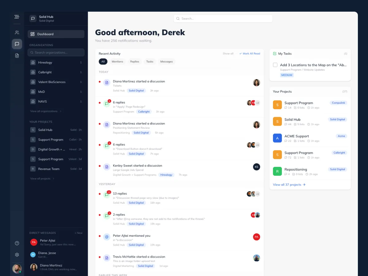
Prefer candid photography of our team and clients. When illustrative imagery is needed, use clean product shots and screen captures set against paper backgrounds with red accent framing, never synthetic AI imagery, gradient meshes, or clip-art.
If the right photo doesn't exist yet, use a bordered placeholder with a monospace caption until it does.

filter: grayscale(1) brightness(1.1) contrast(.85)
Always
- Use real people and real work
- Keep color palette quiet, let the red CTA do the work
- Frame shots with generous crop and whitespace
- Caption with mono metadata
Never
- Stock photos of suited people pointing at charts
- AI-generated human faces or environments
- Gradient meshes, blur overlays, glow effects
- Duotone treatments in red
Aspect ratios
- 4 : 5, portrait, default
- 16 : 9, hero, video
- 1 : 1, social, thumbnails
- 3 : 2, editorial article
Living illustrations
When a surface needs an abstract mark instead of a photograph, use the same vocabulary as the about page: red on paper, wireframe geometry, very slow ambient motion. No fills, no gradients beyond a faint radial aura. Three reference shapes, one for each “what we believe” statement.
The hero of this vocabulary is the nested 3D cube on the about page — three CSS-transform cubes (outer wireframe, mid grid, inner diamond) over a soft red aura, with axis lines through the center and drifting particles. Treat that as the application, not a separate asset; recreate at scale only when a surface explicitly calls for a hero illustration.
How it looks out in the world.
Reference compositions for the three places the system shows up most: the website homepage, a deck title slide, and a social tile. Treat these as canonical, a new layout should start as a variation on one of these, not from scratch.
Growth creates complexity. We help you get ahead of it.
Strategy, software, marketing, and AI, implemented by a team that's been doing this for nearly two decades.
From brand to innovation, faster than you thought possible.
Quick checklist, every surface
- Headlines stay in ink. No italic or red-word emphasis inside a heading.
- Eyebrow above every major heading.
- Numeric proof block (3 stats) within the first fold when possible.
- Mono metadata for version, section, or timestamp in a corner.
- Dot-grid mark appears somewhere, even at 12 px.
- Whitespace, not boxes, does the dividing.
- CTA is a single red button, never two side-by-side.
- If you can't place it in the Brand → Innovation ladder, reconsider.